We planned and designed our whole website and began creating it on wix. We found the template that best fitted our ideas and began to change the things we wanted to. As we began to fill it all in we found that some things were not quite working as we had hoped. We found that the homepage layout did not look quite right as it seemed too simplistic and empty. To try to make it look better we had to place 2 photos on either side. Although this made it look better it still wasnt how we wanted it to look. We had also wanted to have a chatroom in the fan page however it looked too simplistic. The only chatroom available made the website look amateur. I also thought the layout of the shop did not look professional enough and this whole page needed a lot of work to organise it properly. After looking at other layouts I have decided to try a different layout to see if it looks any better. I have not quite finished this new website but it is already looking much better.
Here is a link to our previous website:
Kate Nash Website
Showing posts with label Website. Show all posts
Showing posts with label Website. Show all posts
Thursday, 14 March 2013

Saturday, 9 March 2013
Website Progress
We are currently in the process of constructing our website. Although it is similar to how we wanted originally planned it we have had to change a few things as they were not achievable with the software. We are using wix to create our website and this has let us do most of what we wanted to. We liked the idea of having a banner with images at the top of the website on every page.
Our home page was very similar to how we had planned however the layout meant that we had to large gaps on either side of the page. This meant we had to find images to fill these. Luckily we had lots of images due to the various photoshoots we have done. When we planned it we had not had many images on the home page but this layout looked better with a few images from the gallery placed here. We also wanted the latest news to be easily seen so we had planned to have this on the front page as well as the twitter feed. We chose to have the latest news as though it was written by our artist, this adds a personal touch to the page.
On the 'Music' page we plan to have our music video for 'Foundations' placed at the top with various other Kate Nash song clips underneath. This would promote the artist's album and help to boost sales. We also plan to have both our album cover images placed here too.
The gallery has various images from all the photoshoots we have done. We have different types of images including ones from photoshoots, behind the scenes of filming and out with fans. This helps to show off the star and maintain our star image. It also shows that our star cares about and has a connection with her fans.
The fan page has some merchandise for sale. For this we had to design and edit the images in photoshop to create the tops including some of her lyrics. We also created a chatroom so that her fans can communicate with each other.
We decided a competitions page would be a good way to add interactivity to the site. We have a video clip of our artist saying how to enter and what you win. We thought this would add a more personal element to the website and would engage with the audience more. We wanted to have a submit form to attach a video however the software was limited so we have not yet worked out how to do this. We have also had trouble uploading the video so we have had to upload it to youtube and then embed it.
Our last page features the tour dates and locations. We chose to say that 2 locations had sold out as this made the gigs look more exclusive. We researched in depth about the locations and thought carefully about the order in which the artist would visit them. We also looked into similar artists such as Marina and the Diamonds and Florence and the Machine to see where they had performed. This gave us a better idea of suitable locations.
Our home page was very similar to how we had planned however the layout meant that we had to large gaps on either side of the page. This meant we had to find images to fill these. Luckily we had lots of images due to the various photoshoots we have done. When we planned it we had not had many images on the home page but this layout looked better with a few images from the gallery placed here. We also wanted the latest news to be easily seen so we had planned to have this on the front page as well as the twitter feed. We chose to have the latest news as though it was written by our artist, this adds a personal touch to the page.
On the 'Music' page we plan to have our music video for 'Foundations' placed at the top with various other Kate Nash song clips underneath. This would promote the artist's album and help to boost sales. We also plan to have both our album cover images placed here too.
The gallery has various images from all the photoshoots we have done. We have different types of images including ones from photoshoots, behind the scenes of filming and out with fans. This helps to show off the star and maintain our star image. It also shows that our star cares about and has a connection with her fans.
The fan page has some merchandise for sale. For this we had to design and edit the images in photoshop to create the tops including some of her lyrics. We also created a chatroom so that her fans can communicate with each other.
We decided a competitions page would be a good way to add interactivity to the site. We have a video clip of our artist saying how to enter and what you win. We thought this would add a more personal element to the website and would engage with the audience more. We wanted to have a submit form to attach a video however the software was limited so we have not yet worked out how to do this. We have also had trouble uploading the video so we have had to upload it to youtube and then embed it.
Our last page features the tour dates and locations. We chose to say that 2 locations had sold out as this made the gigs look more exclusive. We researched in depth about the locations and thought carefully about the order in which the artist would visit them. We also looked into similar artists such as Marina and the Diamonds and Florence and the Machine to see where they had performed. This gave us a better idea of suitable locations.
Saturday, 2 February 2013
Website Research 2

Justin Timberlake's countdown website is very different to the other websites I looked at. This website was just a countdown site to the release of a new single. It features an autoplay of the new video and links to buy the single on 'Amazon', 'iTunes', 'Google Play', 'Spotify' and 'Myspace'. There is also an open letter from Justin Timberlake. This adds a personal touch and a direct link between the artist and his fans.

Pink's website is also mainstream and features many of the same features including; tweets, photos, videos, tour dates and news. The use of fan activity again allows for this link to be made between the artist and the fans. There are various fan photos on the site as well as professional photos of Pink looking very glamorous.

Marina and the Diamonds website was particularly key for research as it is also from the genre of 'Indie Pop'. Key features are still seen in this website including; news, photos, videos, shows, lyrics and the store. This allows fans to purchase merchandise for example, jewellery, t-shirts and accessories. A unique feature is the use of the exclusive free download of a song and the members only area. This means her members will feel exclusive and have a closer link with the star.
Thursday, 31 January 2013
Website Research
I researched various different websites to discover some codes and conventions to use as a base when creating our own website. I looked at various different websites from different genres to get an accurate idea of what should be included in a website. For my website, I plan to use some of the ideas from various different types of website to create a website that will suit our artist. It is important to stick to some of the conventions of these websites but also have creativity that will attract and appeal to, our target audience.

Beyonce's is a mainstream artist and her website reflected this. There were various pages including news, events, photos, videos, history and community. There was also a subscribe feature that allowed fans to receive email updates from the website. The use of the 'community' feature also shows Beyonce is a main stream artist as there are various forums for fans to communicate with each other. The use of social networking sites such as 'Facebook' and 'Twitter' also allows a direct link with the artist. I liked the use of the behind the scenes images as this had a more personal touch for the fans. The use of the banner image of the star is also effective as it has the date to her show on the 'Super Bowl half time show'.
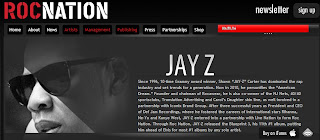
This website was very different to most of the other websites I looked at as this was run by the record label 'Roc Nation'. This website features many pages dedicated to various artists. This means the information on this website is very limited. It has background information and a main image of the star as well as news about videos and awards. Although you cannot specifically subscribe to news about one artist you can subscribe to a newsletter from the record label.

Lady Gaga's website is also very mainstream however there is an artistic touch to it. Tour dates are featured on the main page as well as a live twitter feed. This allows her fans to have a direct link with her and follow her on social network sites. There is also a page that features the latest news and videos allows Lady Gaga's 'Little Monsters' to keep up with the latest Gaga news. A page featuring tour dates and a link to buy tickets to her shows. I particularly liked the use of having all the lyrics to all of her songs. This allows her fans to have a stronger link to her songs as they can sing along. The unique idea of having chat rooms set up online for fans to communicate with each other is also very effective. This allows 'Little Monsters' to chat to other people who have similar interests and something in common.

Beyonce's is a mainstream artist and her website reflected this. There were various pages including news, events, photos, videos, history and community. There was also a subscribe feature that allowed fans to receive email updates from the website. The use of the 'community' feature also shows Beyonce is a main stream artist as there are various forums for fans to communicate with each other. The use of social networking sites such as 'Facebook' and 'Twitter' also allows a direct link with the artist. I liked the use of the behind the scenes images as this had a more personal touch for the fans. The use of the banner image of the star is also effective as it has the date to her show on the 'Super Bowl half time show'.
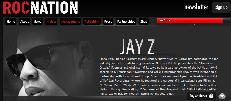
This website was very different to most of the other websites I looked at as this was run by the record label 'Roc Nation'. This website features many pages dedicated to various artists. This means the information on this website is very limited. It has background information and a main image of the star as well as news about videos and awards. Although you cannot specifically subscribe to news about one artist you can subscribe to a newsletter from the record label.

Lady Gaga's website is also very mainstream however there is an artistic touch to it. Tour dates are featured on the main page as well as a live twitter feed. This allows her fans to have a direct link with her and follow her on social network sites. There is also a page that features the latest news and videos allows Lady Gaga's 'Little Monsters' to keep up with the latest Gaga news. A page featuring tour dates and a link to buy tickets to her shows. I particularly liked the use of having all the lyrics to all of her songs. This allows her fans to have a stronger link to her songs as they can sing along. The unique idea of having chat rooms set up online for fans to communicate with each other is also very effective. This allows 'Little Monsters' to chat to other people who have similar interests and something in common.
Subscribe to:
Posts (Atom)