Sunday, 14 April 2013
Saturday, 13 April 2013
Final Digipack Images
Front Cover:

Back Cover:

Inside Cover:

Lyric Sheet:


*When editing the back cover there was no background difference in the colour. This only showed up when viewed on my laptop at home. The entire background should be black*
*The lyric sheet is a different size as it is a fold out design*
Friday, 12 April 2013
Final Website
Kate Nash Website
This is our final website. The layout we chose was designed to be viewed on a widescreen and due to this it appears to be disorganised when viewed on a normal screen. I will upload print screens of how the website should look when I have access to the school macs.
We both worked together on the entire website.
Thursday, 11 April 2013
Wednesday, 10 April 2013
Tuesday, 9 April 2013
Monday, 8 April 2013
Friday, 22 March 2013
Digipack Process
When making my digipack I began by choosing the images I wanted to use. I started by doing the text in photoshop but the text appeared to be fuzzy and out of focus. To stop this from happening I had to edit the image then export it and open it in Adobe Illustrator. I then constructed the clear text in this programme and exported it back to Adobe Photoshop to make the final few changes and save it as a JPEG.
For my digipack I chose to have a fold out insert in the album rather than a booklet form. I had seen Goldfrapp's album insert in this form with a large image on the inside. I liked this idea as I thought it was more interesting and unique than a normal booklet. I chose to still use the conventions of a digipack with the lyrics page and the thank you page as well as having images scattered throughout.
The images I chose had to portray the personality of the artist. I chose the front cover as the 'shh' gesture shows her power during her songs as she says things that would often be seen as blunt. Her attitude throughout her songs is very upfront and direct. The use of the background also stands out and would attract the attention of the audience.
I chose the back cover image as it went well with the front cover. The body language is still very confident but I felt that direct address to the audience was not needed. The image also was the right framing to allow for space for the text to appear. I included a similar colour text to the front cover to create continuity and tie the album together. I had to include the institutional information, to make it accurate I looked at other back covers online and changed the wording slightly to make it appropriate to my artist. I found the barcode image online and I edited it onto my album.
For the inside cover I chose to have this image as it the framing allowed for the text to be placed. I chose this to be a 'thanks' page. This is very common of albums however I didn't want this to be a very serious page. I wanted it to allow a more jokey side to our artist to show. This is shown through her language used in the 'thank you note'. The colours on this page are very similar to those used throughout the album. I chose the black and white image as it was striking but did not draw the attention away from the text.
For the lyrics sheets I chose the same colour schemes as I have used throughout the album. I also chose these 2 images as they had a playful side to them. They also worked well together as they both had the same outfit and a similar style to the pose. I chose to use the 2 first songs on the album to have the lyrics to. These would be the most popular tracks on the album. I also had the images of the birds which I found on the internet but I changed the colour of them to match the colour of the font. I also flipped the image so it would match on the other page.
I chose this image to be the big image as it was a very striking image but also shows the fiesty side to our artist. This contrasts to the other softer images used in the digipack.
Thursday, 14 March 2013
Website Progress
We planned and designed our whole website and began creating it on wix. We found the template that best fitted our ideas and began to change the things we wanted to. As we began to fill it all in we found that some things were not quite working as we had hoped. We found that the homepage layout did not look quite right as it seemed too simplistic and empty. To try to make it look better we had to place 2 photos on either side. Although this made it look better it still wasnt how we wanted it to look. We had also wanted to have a chatroom in the fan page however it looked too simplistic. The only chatroom available made the website look amateur. I also thought the layout of the shop did not look professional enough and this whole page needed a lot of work to organise it properly. After looking at other layouts I have decided to try a different layout to see if it looks any better. I have not quite finished this new website but it is already looking much better.
Here is a link to our previous website:
Kate Nash Website
Here is a link to our previous website:
Kate Nash Website
Wednesday, 13 March 2013
Star Image Change- Azealia Banks
From Azealia Bank’s first music video ‘212’ she appears to be a very down to earth artist. The use of the mise-en-scene is very urban. By using a brick wall as the background and the having the star wearing casual clothing it makes her seem as though she is relatable. The lack of drastic makeup or hair styles also helps to create this image. The use of the almost jokey dancing, looks as though the artist is just having fun as opposed to making a serious music video. As this is her first music video this all works together to create her star image. The use of the black and white also gives it a more stylistic look but also helps create the urban feel. The majority of the music video is filmed with close-ups or medium- close ups with the occasional medium long shot. This creates a more personal direct link with the audience.
Azealia Bank’s second music video for ‘Liquorice’ has a very different feel. This contrasts to her previous music video as this has a dramatic mise-en scene and a much more staged feel. It is clear that this music video has a much higher budget as the costumes and locations are extravagant. She artist also appears to have a much more sexualised approach as well as being more serious. This shows a complete change from her star image created by ‘212’. The majority of her music videos since ‘Liquorice’ have also seen this new star image be shown and maintained. Many artists do not normally have this much of a drastic star image change from one video to the next. One reason for this dramatic change could have been the success of her first single.
Progress After Robbery
After the robbery in the media department we are finally
getting back to normal. Luckily all our footage and sequences had been backed
up a few days before. This meant we still had most of our work still. When we
came to attempting to edit again we found that we had lost all our green screen
edits. We have started to edit them again. This time we have decided to change
some of the backgrounds and we want to try to make them look better. We now
have new macs and cameras so we can carry on with all of our work as we were
before. Although we have new macs they have different programmes so we have to
edit on the older macs. When we changed computers it managed to put our whole
video slightly out of sync so we had to go back and fix all of this. We finally
did it when we had to change computers again and it happened again. This time I
had got the hang of tweeking it to be perfect and it didn’t take too long. We
finally have it all back in sync and we just have the green screens left to
edit. Once we have done this we just have to make the whole video look snappy
with quick edits. We will have a better idea of how it will look once we have
the green screens done. The editing is taking a lot longer than we had hoped as
these computers are old. Despite this we are making do and we have almost
finished editing.
Sunday, 10 March 2013
Photoshoot
Today we did a photoshoot for the digipack and website pictures. We had access to the professional equipment as my mum is a photographer. We set it all up in my living room, this included the backdrop and lights. We then tried various different outfits to see which ones suited our artist. We decided to have different types of shots including ones which looked as though they were from a photoshoot as well as some more fun shots which show the personality of the artist. We were given some tips on how to use the equipment but we both learnt a lot through using all the proper equipment to create good quality pictures. I am really happy with how the pictures looked and I am looking forward to editing them all and putting them on the website.


Saturday, 9 March 2013
Website Progress
We are currently in the process of constructing our website. Although it is similar to how we wanted originally planned it we have had to change a few things as they were not achievable with the software. We are using wix to create our website and this has let us do most of what we wanted to. We liked the idea of having a banner with images at the top of the website on every page.
Our home page was very similar to how we had planned however the layout meant that we had to large gaps on either side of the page. This meant we had to find images to fill these. Luckily we had lots of images due to the various photoshoots we have done. When we planned it we had not had many images on the home page but this layout looked better with a few images from the gallery placed here. We also wanted the latest news to be easily seen so we had planned to have this on the front page as well as the twitter feed. We chose to have the latest news as though it was written by our artist, this adds a personal touch to the page.
On the 'Music' page we plan to have our music video for 'Foundations' placed at the top with various other Kate Nash song clips underneath. This would promote the artist's album and help to boost sales. We also plan to have both our album cover images placed here too.
The gallery has various images from all the photoshoots we have done. We have different types of images including ones from photoshoots, behind the scenes of filming and out with fans. This helps to show off the star and maintain our star image. It also shows that our star cares about and has a connection with her fans.
The fan page has some merchandise for sale. For this we had to design and edit the images in photoshop to create the tops including some of her lyrics. We also created a chatroom so that her fans can communicate with each other.
We decided a competitions page would be a good way to add interactivity to the site. We have a video clip of our artist saying how to enter and what you win. We thought this would add a more personal element to the website and would engage with the audience more. We wanted to have a submit form to attach a video however the software was limited so we have not yet worked out how to do this. We have also had trouble uploading the video so we have had to upload it to youtube and then embed it.
Our last page features the tour dates and locations. We chose to say that 2 locations had sold out as this made the gigs look more exclusive. We researched in depth about the locations and thought carefully about the order in which the artist would visit them. We also looked into similar artists such as Marina and the Diamonds and Florence and the Machine to see where they had performed. This gave us a better idea of suitable locations.
Tuesday, 5 March 2013
Album Cover

I have chosen an image from a photoshoot we did. Above is the original image I thought would look good as an album cover. I have then used photoshop to edit them with a few different effects. Here are a few of the edits:


Friday, 15 February 2013
Editing
Most of the editing has gone quite well. I have managed to
master getting the clips exactly where we want them. Although it has been going
well we have encountered quite a few problems. One of the first problems was
the green screens. When editing some of these they did not edit smoothly. We
found that no matter how hard we tried we either had some of the green
background showing or it caused some of the hair to look fuzzy and the
background to show through. We eventually had to just make do as this was a
result of technical limitations. When we had finally edited all the green
screen shots we liked we found that we liked different performances for certain
parts of the song. We then decided to match up these bits we liked with the
song. The hardest part to match up and use shots we liked was in the 3 chorus’
at the end of the song. We found that this got a bit repetitive and so we had
to have lots of shots to make it appear interesting. For this we decided to
break up other shots so we could have snappier edits. We spent a long time
making all of our edits look snappy but still edit on the beat. As we began
editing more and more of it we became fussier about the lip syncing and edits.
We had to have it perfect! I think that now we have it all in sync and we are
happy with it. When it came to editing the narrative we found that we had to
break up the narrative and have performance shots in between. I think this was
because we had to rush the pub filming and therefore it didn’t look quite right
when it was all edited together. When we split it up however it worked and made
sense. As well as splitting up narrative we also had one or two continuity
issues but we managed to solve these as best we could. The main one was in the
bedroom scene when I sat up in one shot and again slightly in the next. When
filming in public places we had some problems with people walking into shots.
It looked good if people were appearing natural if they walked into a shot.
When filming outside KFC a man walked into the shot, looked shocked and then
posed before walking out again. Although this was entertaining it meant we had
to re-film this. There was also a shot in the pub when Luke walked into the
back of the shot. When editing we found that we had wanted to use that exact
bit however we couldn’t. Instead we had to find an alternative shot we could
use. We shot the common room shots so we could use them in case we needed to,
but when we came to edit we found that they did not fit with the rest of the
video so we have not used them. There was one shot where I left the shot and
walked up the stairs, we decided to reverse this shot so I sat down instead. We
then used this to fill a small blank we had with no singing. We still have one
or two blanks at the moment but we are working on something to fill these gaps.
I’m pleased with how the editing has gone and how good the music video looks. I
can’t wait to finish it all and see the final product!!
Wednesday, 13 February 2013
Filming Update

Tuesday, 12 February 2013
Voyeurism- Kanye West
The voyeurism seen in Kanye West’s ‘Gold Digger’ is different to that seen in Rihanna’s music video. The main reason for this is the difference it artist gender. In Rihanna’s music video she is seen is being sexually desirable and the central focus of the men in the video. However, in Kanye West’s video the women are seen as sexual objects as he is the main focus throughout. The use of the mise-en-scene helps to create this voyeuristic view of women. The use of minimal clothing that highlights the sexualised features and exaggerated makeup makes the women appeal to a male audience. The camera is also shot as if from a male perspective, which highlights these features. The use of fragmented shots of body parts also adds to this sexualised approach to the music video. Paralinguistic features have also been used to highlight this sexually desirable appeal to men. The use of the seductive looks and the poses also accentuates certain body parts. The female characters also often look directly into the camera through their lashes which is often seen as very sultry, flirty behaviour. Attention is also drawn to their lips which has sexual connotations. The men in this video are often very stationary which draws more attention to the female characters. This also shows they are more dominant as the women dancing around them. It is almost as though they are aiming to please the men.
Saturday, 2 February 2013
Shooting Day 7
Shooting Day 7: When it came to editing the narrative we had
previously shot we noticed that the pub scenes were too dark. This meant we had
to re-shoot it. We also decided that we should use the first verse for
narrative and we could film this here. We decided on what shots we wanted to do
and we found a nice pub. We then went to ask for permission and they said we
could use it before opening times. This was perfect as we would be able to use
any space we needed to. I had asked two of my friends, Sam and Sean to come and
be extras in this scene. They turned up late so while we were waiting we
decided to shoot some more performance shots including more close ups which we
noticed we had been missing with the other shoots. When they finally turned up
we only had 10 minutes before the pub opened. We had to quickly rush the shots
and we were worried we wouldn’t have what we needed but we had to make do.
There were also dramas between the cast members which meant this shoot was
quite awkward. After we finished we all decided it was time to go and get some
breakfast.


Website Research 2

Justin Timberlake's countdown website is very different to the other websites I looked at. This website was just a countdown site to the release of a new single. It features an autoplay of the new video and links to buy the single on 'Amazon', 'iTunes', 'Google Play', 'Spotify' and 'Myspace'. There is also an open letter from Justin Timberlake. This adds a personal touch and a direct link between the artist and his fans.

Pink's website is also mainstream and features many of the same features including; tweets, photos, videos, tour dates and news. The use of fan activity again allows for this link to be made between the artist and the fans. There are various fan photos on the site as well as professional photos of Pink looking very glamorous.

Marina and the Diamonds website was particularly key for research as it is also from the genre of 'Indie Pop'. Key features are still seen in this website including; news, photos, videos, shows, lyrics and the store. This allows fans to purchase merchandise for example, jewellery, t-shirts and accessories. A unique feature is the use of the exclusive free download of a song and the members only area. This means her members will feel exclusive and have a closer link with the star.
Thursday, 31 January 2013
Website Research
I researched various different websites to discover some codes and conventions to use as a base when creating our own website. I looked at various different websites from different genres to get an accurate idea of what should be included in a website. For my website, I plan to use some of the ideas from various different types of website to create a website that will suit our artist. It is important to stick to some of the conventions of these websites but also have creativity that will attract and appeal to, our target audience.

Beyonce's is a mainstream artist and her website reflected this. There were various pages including news, events, photos, videos, history and community. There was also a subscribe feature that allowed fans to receive email updates from the website. The use of the 'community' feature also shows Beyonce is a main stream artist as there are various forums for fans to communicate with each other. The use of social networking sites such as 'Facebook' and 'Twitter' also allows a direct link with the artist. I liked the use of the behind the scenes images as this had a more personal touch for the fans. The use of the banner image of the star is also effective as it has the date to her show on the 'Super Bowl half time show'.
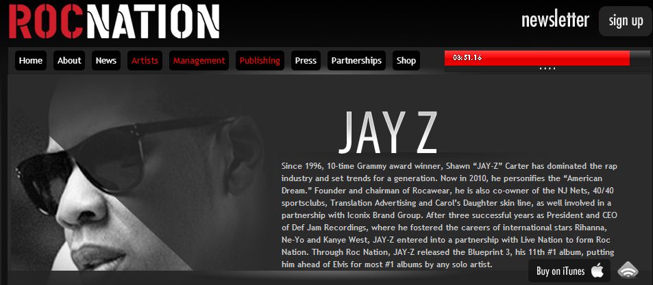
This website was very different to most of the other websites I looked at as this was run by the record label 'Roc Nation'. This website features many pages dedicated to various artists. This means the information on this website is very limited. It has background information and a main image of the star as well as news about videos and awards. Although you cannot specifically subscribe to news about one artist you can subscribe to a newsletter from the record label.

Lady Gaga's website is also very mainstream however there is an artistic touch to it. Tour dates are featured on the main page as well as a live twitter feed. This allows her fans to have a direct link with her and follow her on social network sites. There is also a page that features the latest news and videos allows Lady Gaga's 'Little Monsters' to keep up with the latest Gaga news. A page featuring tour dates and a link to buy tickets to her shows. I particularly liked the use of having all the lyrics to all of her songs. This allows her fans to have a stronger link to her songs as they can sing along. The unique idea of having chat rooms set up online for fans to communicate with each other is also very effective. This allows 'Little Monsters' to chat to other people who have similar interests and something in common.

Beyonce's is a mainstream artist and her website reflected this. There were various pages including news, events, photos, videos, history and community. There was also a subscribe feature that allowed fans to receive email updates from the website. The use of the 'community' feature also shows Beyonce is a main stream artist as there are various forums for fans to communicate with each other. The use of social networking sites such as 'Facebook' and 'Twitter' also allows a direct link with the artist. I liked the use of the behind the scenes images as this had a more personal touch for the fans. The use of the banner image of the star is also effective as it has the date to her show on the 'Super Bowl half time show'.
This website was very different to most of the other websites I looked at as this was run by the record label 'Roc Nation'. This website features many pages dedicated to various artists. This means the information on this website is very limited. It has background information and a main image of the star as well as news about videos and awards. Although you cannot specifically subscribe to news about one artist you can subscribe to a newsletter from the record label.

Lady Gaga's website is also very mainstream however there is an artistic touch to it. Tour dates are featured on the main page as well as a live twitter feed. This allows her fans to have a direct link with her and follow her on social network sites. There is also a page that features the latest news and videos allows Lady Gaga's 'Little Monsters' to keep up with the latest Gaga news. A page featuring tour dates and a link to buy tickets to her shows. I particularly liked the use of having all the lyrics to all of her songs. This allows her fans to have a stronger link to her songs as they can sing along. The unique idea of having chat rooms set up online for fans to communicate with each other is also very effective. This allows 'Little Monsters' to chat to other people who have similar interests and something in common.
Wednesday, 30 January 2013
Monday, 28 January 2013
Shooting Day 6


Saturday, 19 January 2013
Shooting Day 5
Shooting Day 5: Today we shot our narrative sequences. We
had previously planned to use a cafe however they said we could not use it. We
then went in search of another location. We then asked in KFC and they said
yes. Although it wasn’t exactly as we had planned, we hoped it would still look
good. We attempted to film it in the window seats like we had drawn in our
storyboard however when it came to filming the inside shots, it was not light
enough. This meant we had to change tables; this was not an issue as it still
looked good. We then filmed these shots while the others bought some food. We
then went back to the car to go to the second location when we decided we could
film an argument scene here. We used the car to make it more dramatic. It was
difficult to place the camera in the car however eventually we managed to
balance it. At first we didn’t know what to argue about but Zainab then created
a situation and we had an argument in the street. Luckily there was no one
around to see it. Once we had finished filming the argument we went to my house
to film the bedroom scene. We spent time doing my hair and makeup differently
and setting up all the lights. We then filmed what we had storyboarded. Sophie
then had the idea of filming a birds eye shot moving across the view of the
bed. We agreed to try it and were surprised by how good it looked. After this
we drove to the pub to shoot the last few shots. By now we were all starving so
while we waited for the others we ordered some food. When they finally got
there we filmed the pub scenes. We were worried that it looked too dark but it
was quite a small space so we couldn’t set up the lights. We still did what we
could with the light we had. After this we decided we needed a bus stop scene
to make it look more urban and ‘down to earth’. Originally this scene was
supposed to be shot in the gym however we couldn’t get permissions for the gym.
We managed to get what we wanted in just two takes. I was surprised at how
light it looked on camera due to the light at the bus stop. After a long day
filming we had finally finished! We were all tired on the way home and Luke
even fell asleep in the car.


Thursday, 17 January 2013
Chase and Status- Let You Go
There is clear intertextuality in the Chase and Status music video for ‘Let You Go’. The references are made to the TV chat show, ‘The Jeremy Kyle Show’. This video presents a spin off show called the ‘Patrick Chase Show’. We do not see the identity of the main character until he is revealed as the chat show host. This is a narrative based music video with no performance scenes. At times the sounds there are sound bridges from the narrative heard over the music. The camerawork and framing used is very cinematic throughout.The artist isn’t seen throughout the music video. This is common for Chase and Status but it also means that their star image is not affected.
As the tension on stage builds so does the music until a fight finally breaks out on stage. This supports Vernallis’ theory of the video matching the music. The lyrics are also amplified by the visuals as they add a new meaning to them.
Throughout the video the use of drugs is implied which is also hypocritical of the characters morals as he despises these on his show. The use of the canted angle and jolty movements is use to signify that the character is drunk or disorientated. The various disorientated shots also help to portray the lack of control over his body and actions. As the music builds the edits become quicker to match the beat.. The use of contrasting colours is very obvious. The bright colours on the show contrasts with the dull colours in the flat, car and club which signifies that these actions are wrong. The use of the red lighting also signifies that these actions are immoral or forbidden. Once the character has carried out these actions he then shows up to the studio has his makeup done then goes back on stage. This could signify that we never really know what happens behind the scenes of these shows and after the camera stops rolling.
Beyonce- Naughty Girl
Beyonce’s music video for ‘Naughty Girl’ supports the ideas
of Vernallis. The use of the cuts on the beat and the fragmented actions are
shown throughout the music video. The actions are often disjointed which drives
the video forward. This is a performance based music video with very little
narrative. The dated style with a modern twist on the 1920’s style.
The use of voyeurism is also very clear. This is shown by
the dance moves, with the use of mirrors and silhouettes and also by the use of
slow motion. The lighting is also placed very carefully to accentuate certain
features adding to her sexual appeal. The camera and framing also adds to the
voyeuristic nature. The use of fragmented shots of body parts combined with the
flirty and seductive actions gives Beyonce the sex appeal. Her slow exaggerated
actions as she removes the coat also help to illustrate the lyrics. Although
there is voyeurism it appears Beyonce still remains in control. Throughout the
video everyone is focused on her and they are all situated below her. This has
symbolises that she is more important. The use of the red dress and coat also
stands out from the dull colours of all the other characters clothes. This also
adds to Beyonce being the centre of attention throughout the video. . Beyonce
is always seen as being very glamorous in all her music videos. This music
video is no exception to this. Even when she is seen in soapy water she still
looks very glamorous.
From the very beginning of the music video Beyonce has the
male attention focused of her. During the dance routine she then takes control.
When the men try to ‘show off’ on stage they manage to fail and fall over. This
is all working together to create a powerful representation of women and a weak
representation of men. The men in the music
video also appear as accessories to the star. An example of this is when a man
lifts her off the piano.
Throughout the music video Beyonce makes direct eye contact
with the audience. This creates a direct link with the audience. I also noticed
that no other characters look directly into the camera; they all look slightly
off stage. This means that there is no link between them and the audience. Their
attention is then fully engaged by the artist.
Wednesday, 16 January 2013
Shooting Day 4
Shooting Day 4: We filmed our green screen shots today. We
tried the birds eye view again however we decided this was not very flattering
so we tried other shots instead. I did
not feel very well when we were filming this as I had a headache and the lights
did not help. We still carried on and filmed it all to get it done. We tried
lots of shots including sitting, standing and lying down. We plan to use
various different moving backgrounds on these shots to make it more
interesting. We had a few problems with the lights firstly working out how to
set them up, and then we had to get rid of any shadows. We found that in some
shots there were still small shadows but we will see how it looks when it comes
to editing it.


Inspiration Music Video's- Amy Winehouse
Amy Winehouse’s music video for ‘You Know I’m no Good’ is similar to the narrative we have used for our music video. The use of the attitude towards the bad boyfriend is similar to our stars attitude. Although the style of music and the star image is very different to ours the themes are similar. The themes throughout this music video are a lot more adult than our music video which would be aimed at a younger audience. I particularly like the use of the moving images in the Polaroid pictures and the film reel. The use of colour is also very different to our video. Ours incorporates a lot of bright colours and Amy Winehouse’s video uses lots of blue and darker tones throughout.
Monday, 14 January 2013
Shooting Day 3


Shooting Day 3: We had not properly organised the shoot today we just wanted to see if we could find any suitable locations. We were wandering round school trying to find somewhere when we walked past the brick wall and the sun was shining on it. Sophie suggested that we should try a few shots in front of the wall just to see how it looked. We all agreed and so we shot some of the chorus in the sun. This was filmed in January so it was still very cold so we had to be quick. We were surprised at just how good this shot looked and we decided we liked the light so much to try another few shots. We then saw the stairs and thought they could work well and contrast with the costume. The colours of the costume and the wall looked amazing with the sun shining on them as well as it making my skin look flawless. After we finished this shot we decided to film some shots in the common room. This was just a spontaneous idea so we could have some extra shots should we need them. We weren’t sure how these would turn out however we thought it was worth a try. It was hard to coordinate everyone to not look at the camera and still look natural. Eventually we managed to get one or two good shots we were pleased with.
Wednesday, 9 January 2013
Shooting Day 2
Shooting Day 2: Today we shot the street shots with the artist dressed in the American print leggings. For this shoot I had to be dressed in this outfit in the street and on a zebra crossing while lip singing to the song. Needless to say, I got a few funny looks. We filmed this in December and so it was freezing! Due to the fact it was -1°C we had to film it quickly. While on camera, I could not wear my coat however as soon as the camera was off, I was finally able to warm up a little. Due to the cold weather we tried to film this sequence as quick as possible. As it was our first proper shooting experience, it did not always go to plan. An example of this was the walking shot we attempted, we liked it but it looked too shaky and unprofessional. It soon started to rain and we could no longer shoot.


Friday, 4 January 2013
Record Label

After researching various different record labels I have decided our artist could be signed to Polydor. I chose this record label as our artist would be seen as an up and coming and a new breakthrough act. This record label seemed like a perfect choice as they have already signed indie and pop artists such as Snow Patrol and Duffy. Polydor is also based in the UK which makes it more likely to sign our down to earth British artist.
Wednesday, 2 January 2013
Institutional Research
Def Jam Recordings:
Island Def Jam Music Group was formed in 1999 when Universal
Music Group merged Island Records and Def Jam Recordings. Def Jam Recordings is
an American record which is focused primarily on hip hop and urban music. Def
Jam was created by Rick Rubin and its first release was a single by his
punk-rock group ‘Hose’. The first few singles released did well, leading to a
distribution deal with CBS Records (this later became Sony Music
Entertainment). Def Jam signed its first and only heavy metal band ‘Slayer’ in
1986. Soon after the label signed ‘Public Enemy’, whose controversial lyrics
earned the label a reputation. In 1988 Lyor Cohen became president of Def Jam
and Rub left to form Def American Recordings (now known as American
Recordings). Def Jam Recordings currently signs artists such as; Jennifer
Lopez, Kanye West and Gorillaz.
Polydor:
Polydor is owned by Universal Music Group and has its
headquarters based in the UK. Polydor first became a pop music label in 1946. During
the 1970’s Polydor became a major rock label but also had many disco artists.
They had platinum-selling disco acts such as the Bee Gees and Gloria Gaynor. In
the early 1980’s the label signed The Who and The Jam. Although the American branch did not
do well, in the UK, Polydor is still one of the strongest labels in the
country. Polydor has signed artists such
as, Cheryl Cole, Duffy, Ellie Goulding as well as indie artist such as Snow
Patrol and The Maccabees. In Spring 2006 Polydor launched Fascination Records.
Both Girls Aloud and Sophie Ellis-Bextor transferred to the new label as well
as new artists such as The Saturdays and Girls Can’t Catch. Miley Cyrus and
Demi Lovato are some of the newest artists to transfer from the US label
Hollywood Records, to Fascination.
Roc Nation:
Roc Nation was established in April 2008 when Live Nation
partnered with Jay-Z. Roc Nation also has an entertainment company named
Takeover Roc Nation, located in the UK. Records are released with Sony Music
Entertainment and partners with Live Nation. Since it was first established Roc
Nation has signed artists such as, Rita Ora, Alexis Jordan and Sugababes. Roc
Nation also manages artists such as Shakira, Kylie Minogue and Rihanna. As well
as managing and signing artists, Chase and Status and Timbaland are just a few
producers as well as DJ’s such as Solange Knowles.
Subscribe to:
Comments (Atom)